By Datapleth.io | August 28, 2019
Following our previous post on the USA yield curve inversion, we are going to evaluate the situation in other countries, starting with France. We can observe similar pattern on the recent interest rates for which there is an inversion, the long term rates are lower than the short term rates. However, we were not (yet) able to get historical data for all horizon. “Banque de France” is not releasing such information as of today.
Preparation
Let’s as usual load the libraries we need.
library(xml2)
library(dplyr)
library(data.table)
library(plotly)
library(knitr)
library(kableExtra)
Sys.setlocale("LC_ALL","C")
## [1] "LC_CTYPE=C;LC_NUMERIC=C;LC_TIME=C;LC_COLLATE=C;LC_MONETARY=C;LC_MESSAGES=en_US.UTF-8;LC_PAPER=en_US.UTF-8;LC_NAME=C;LC_ADDRESS=C;LC_TELEPHONE=C;LC_MEASUREMENT=en_US.UTF-8;LC_IDENTIFICATION=C"Getting and cleaning the data for France
Data source for France data is French central bank, known as “Banque de France” (see here. They provide the data as HTML and CSV as one URL with all historical values.
url_france <- "http://webstat.banque-france.fr/fr/downloadFile.do?id=5385691&exportType=csv"
## Get column information, including name
france_features <- read.csv(
    file = url_france,
    header = FALSE,
    nrows = 6,
    stringsAsFactors = FALSE,
    sep = ";")
## Get Data
all_france_data_raw <- read.csv(
    file = url_france,
    skip = 6,
    header = FALSE,
    stringsAsFactors = FALSE,
    sep = ";")
Once this is done, we convert the data.frame as data.table and we check an extract.
data.table::setDT(all_france_data_raw)
data.table::setnames(all_france_data_raw, make.names(as.character(france_features[2,])))
knitr::kable(head(all_france_data_raw)) %>%
    kable_styling(
        bootstrap_options = c(
            "striped"
            , "hover"
            , "condensed"
            , "responsive"
            )
) %>% scroll_box(width = "100%")| Code.s..rie.. | FM.D.FR.EUR.FR2.BB.FR10YT_RR.YLD | FM.D.FR.EUR.FR2.BB.FR1MT_RR.YLD | FM.D.FR.EUR.FR2.BB.FR1YT_RR.YLD | FM.D.FR.EUR.FR2.BB.FR2YT_RR.YLD | FM.D.FR.EUR.FR2.BB.FR30YT_RR.YLD | FM.D.FR.EUR.FR2.BB.FR3MT_RR.YLD | FM.D.FR.EUR.FR2.BB.FR5YT_RR.YLD | FM.D.FR.EUR.FR2.BB.FR6MT_RR.YLD | FM.D.FR.EUR.FR2.BB.FR9MT_RR.YLD |
|---|---|---|---|---|---|---|---|---|---|
| 10/12/2019 | 0,016 | -0,813 | -0,591 | -0,615 | 0,807 | -0,65 | -0,372 | -0,637 | -0,633 |
| 09/12/2019 | 0,015 | -0,803 | -0,589 | -0,605 | 0,801 | -0,644 | -0,373 | -0,637 | -0,635 |
| 08/12/2019 |
|
|
|
|
|
|
|
|
|
| 07/12/2019 |
|
|
|
|
|
|
|
|
|
| 06/12/2019 | 0,031 | -0,881 | -0,599 | -0,596 | 0,812 | -0,649 | -0,35 | -0,639 | -0,634 |
| 05/12/2019 | 0,023 | -0,797 | -0,604 | -0,596 | 0,8 | -0,65 | -0,359 | -0,64 | -0,632 |
We change now the features names to get a similar structure as for USA data. We will also have to clean the table as numeric separator are commas and missing values are dashes.
## a function to convert "-0,371" as "-0.371" and "-" as NA
convert2string <- function(x){
    as.numeric(
        gsub(
            pattern = ",",
            replacement = ".",
            x = x
        )
    )
}

## We use data table "way" to convert all numerical features
all_france_data <- all_france_data_raw[ ,
                                        lapply(.SD, convert2string) ,
                                        .SDcols = names(all_france_data_raw) %like% "FM"
                                        ]
knitr::kable(head(all_france_data)) %>%
    kable_styling(
        bootstrap_options = c(
            "striped"
            , "hover"
            , "condensed"
            , "responsive"
            )
) %>% scroll_box(width = "100%")| FM.D.FR.EUR.FR2.BB.FR10YT_RR.YLD | FM.D.FR.EUR.FR2.BB.FR1MT_RR.YLD | FM.D.FR.EUR.FR2.BB.FR1YT_RR.YLD | FM.D.FR.EUR.FR2.BB.FR2YT_RR.YLD | FM.D.FR.EUR.FR2.BB.FR30YT_RR.YLD | FM.D.FR.EUR.FR2.BB.FR3MT_RR.YLD | FM.D.FR.EUR.FR2.BB.FR5YT_RR.YLD | FM.D.FR.EUR.FR2.BB.FR6MT_RR.YLD | FM.D.FR.EUR.FR2.BB.FR9MT_RR.YLD |
|---|---|---|---|---|---|---|---|---|
| 0.016 | -0.813 | -0.591 | -0.615 | 0.807 | -0.650 | -0.372 | -0.637 | -0.633 |
| 0.015 | -0.803 | -0.589 | -0.605 | 0.801 | -0.644 | -0.373 | -0.637 | -0.635 |
| NA | NA | NA | NA | NA | NA | NA | NA | NA |
| NA | NA | NA | NA | NA | NA | NA | NA | NA |
| 0.031 | -0.881 | -0.599 | -0.596 | 0.812 | -0.649 | -0.350 | -0.639 | -0.634 |
| 0.023 | -0.797 | -0.604 | -0.596 | 0.800 | -0.650 | -0.359 | -0.640 | -0.632 |
## add the date back
all_france_data <- cbind(
    all_france_data_raw[ , Code.s..rie..],
    all_france_data)

## Compute dates in correct locale
all_france_data[ , NEW_DATE := as.Date(
    as.POSIXlt(x = all_france_data_raw$Code.s..rie..,
               format = "%d/%m/%Y")
)
]
all_france_data[ , V1 := NULL ]
knitr::kable(head(all_france_data)) %>%
    kable_styling(
        bootstrap_options = c(
            "striped"
            , "hover"
            , "condensed"
            , "responsive"
            )
) %>% scroll_box(width = "100%")| FM.D.FR.EUR.FR2.BB.FR10YT_RR.YLD | FM.D.FR.EUR.FR2.BB.FR1MT_RR.YLD | FM.D.FR.EUR.FR2.BB.FR1YT_RR.YLD | FM.D.FR.EUR.FR2.BB.FR2YT_RR.YLD | FM.D.FR.EUR.FR2.BB.FR30YT_RR.YLD | FM.D.FR.EUR.FR2.BB.FR3MT_RR.YLD | FM.D.FR.EUR.FR2.BB.FR5YT_RR.YLD | FM.D.FR.EUR.FR2.BB.FR6MT_RR.YLD | FM.D.FR.EUR.FR2.BB.FR9MT_RR.YLD | NEW_DATE |
|---|---|---|---|---|---|---|---|---|---|
| 0.016 | -0.813 | -0.591 | -0.615 | 0.807 | -0.650 | -0.372 | -0.637 | -0.633 | 2019-12-10 |
| 0.015 | -0.803 | -0.589 | -0.605 | 0.801 | -0.644 | -0.373 | -0.637 | -0.635 | 2019-12-09 |
| NA | NA | NA | NA | NA | NA | NA | NA | NA | 2019-12-08 |
| NA | NA | NA | NA | NA | NA | NA | NA | NA | 2019-12-07 |
| 0.031 | -0.881 | -0.599 | -0.596 | 0.812 | -0.649 | -0.350 | -0.639 | -0.634 | 2019-12-06 |
| 0.023 | -0.797 | -0.604 | -0.596 | 0.800 | -0.650 | -0.359 | -0.640 | -0.632 | 2019-12-05 |
## We change the names
old_names <- c(
    "NEW_DATE",
    "FM.D.FR.EUR.FR2.BB.FR1MT_RR.YLD",
    "FM.D.FR.EUR.FR2.BB.FR3MT_RR.YLD",
    "FM.D.FR.EUR.FR2.BB.FR6MT_RR.YLD",
    "FM.D.FR.EUR.FR2.BB.FR9MT_RR.YLD",
    "FM.D.FR.EUR.FR2.BB.FR1YT_RR.YLD",
    "FM.D.FR.EUR.FR2.BB.FR2YT_RR.YLD",
    "FM.D.FR.EUR.FR2.BB.FR5YT_RR.YLD",
    "FM.D.FR.EUR.FR2.BB.FR10YT_RR.YLD",
    "FM.D.FR.EUR.FR2.BB.FR30YT_RR.YLD"
)
new_names <- c(
    "NEW_DATE",
    "BC_1MONTH",
    "BC_3MONTH",
    "BC_6MONTH",
    "BC_9MONTH",
    "BC_1YEAR",
    "BC_2YEAR",
    "BC_5YEAR",
    "BC_10YEAR",
    "BC_30YEAR"
)
data.table::setnames(
    x = all_france_data,
    old = old_names,
    new = new_names)
Finally we create a data set in long format.
all_france_data_long <- data.table::melt(
    all_france_data,
    measure.vars = c(
        "BC_1MONTH", "BC_3MONTH", "BC_6MONTH", "BC_9MONTH",
        "BC_1YEAR", "BC_2YEAR", "BC_5YEAR",
        "BC_10YEAR", "BC_30YEAR"),
    variable.name = "horizon",
    value.name = "rate")
And we convert horizon to numerical values in months, add a data column as numeric.
all_france_data_long[ horizon == "BC_1MONTH", horizon := "1"]
all_france_data_long[ horizon == "BC_3MONTH", horizon := "3"]
all_france_data_long[ horizon == "BC_6MONTH", horizon := "6"]
all_france_data_long[ horizon == "BC_9MONTH", horizon := "9"]
all_france_data_long[ horizon == "BC_1YEAR", horizon := "12"]
all_france_data_long[ horizon == "BC_2YEAR", horizon := "24"]
all_france_data_long[ horizon == "BC_5YEAR", horizon := "60"]
all_france_data_long[ horizon == "BC_10YEAR", horizon := "120"]
all_france_data_long[ horizon == "BC_30YEAR", horizon := "360"]
all_france_data_long[, horizon := as.numeric(as.character(horizon))]
save(all_france_data_long, file = "./data/all_france_rate.Rda")
We make a quick plot, it’s always usefull to explore the data.
g <- ggplot(all_france_data_long)
g <- g + geom_point(aes(x = NEW_DATE,
                        y = rate,
                        col = horizon),
                    alpha = 0.5, size = 0.5)
g <- g + facet_grid(facets =  horizon ~ . )
g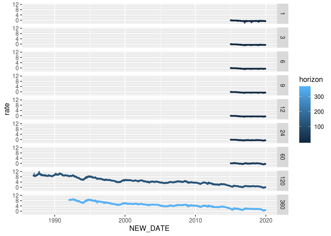
Plotting the 3d yield curve
There are several alternatives to plot 3d surfaces in R but to make it
interactive, we choose the plotly package. We have to move back the data in
a long format.
For the surface color, we will plot it as the ration to rate with 3month horizon as reference. Thus we create a new matrix with the calculation and deal with special values when 3 months rate is 0.
## reshape de data to get a matrix (for plotly)
d <- copy(all_france_data_long)
d <- data.table::dcast(d, NEW_DATE ~ horizon, value.var = "rate")
d[ , NEW_DATE := NULL]

## compute ratio to 3 month rate
c <- copy(d)
setnames(c, make.names(names(c)))
c[ , ':=' (
    X1 = (X1-X3) / abs(X3),
    X6 = (X6-X3) / abs(X3),
    X9 = (X9 - X3) / abs(X3),
    X12 = (X12 - X3) / abs(X3),
    X24 = (X24 - X3) / abs(X3),
    X60 = (X60 - X3) / abs(X3),
    X120 = (X120 - X3) / abs(X3),
    X360 = (X360 - X3) / abs(X3)
)]
## deal with zero values
c[ X3 == 0 | is.na(X3), ':=' (
    X1 = NA,
    X6 = NA,
    X9 = NA,
    X12 = NA,
    X24 = NA,
    X60 = NA,
    X120 = NA,
    X360 = NA
)]
c[ , X3 := 1 ]
We are now ready to plot. We choose the color theme of Dark2 palette (green & orange).
p <- plot_ly(
    x = sort(unique(all_france_data_long$NEW_DATE)),
    y = sort(unique(all_france_data_long$horizon)),
    z = t(as.matrix(d)),
    type = "surface",
    surfacecolor = t(as.matrix(c)),
    cmin = -1,
    cmax = +1,
    colorscale = list(
        list(
            0,
            "rgb(215, 95, 2)"
        ),
        list(
            0.5,
            "rgb(231, 245, 255)"
        ),
        list (
            1,
            "rgb(25, 155, 115)"
        )
    ),
    colorbar = list(
        title='ratio to<br>3 month<br>yield',
        side = 'bottom',
        thickness='10',
        xpad = 5,
        y = 0.8
    ),
    lighting = list(
        ambient = 0.8,
        diffuse = 0.8,
        specular = 0.2,
        roughness = 0.8,
        fresnel = 0.2
    ),
    opacity = 0.9,
    hoverlabel = list(
        bgcolor = "rgb(255, 255, 255)"
    )
) %>%
    plotly::layout(
        #title = "3D yield curve",
        width = 800,
        height = 500,
        scene=list(
            xaxis=list(title="date"),
            yaxis=list(title="horizon"),
            zaxis=list(title="rate"),
            aspectmode = "manual",
            aspectratio = list(x=4,y=2,z=1.3),
            camera = list(
                eye = list(x = 3, y = -3, z = 0.3 ),
                center = list( x = 0.8, y = 0, z = 0)
            )
        )
    ) %>%
    config(displayModeBar = F)
p
References
From The New York Times :
- https://www.nytimes.com/2019/08/15/upshot/inverted-yield-curve-bonds-football-analogy.html
- https://www.nytimes.com/interactive/2015/03/19/upshot/3d-yield-curve-economic-growth.html?module=inline
Other R works :