By Datapleth.io | October 7, 2019
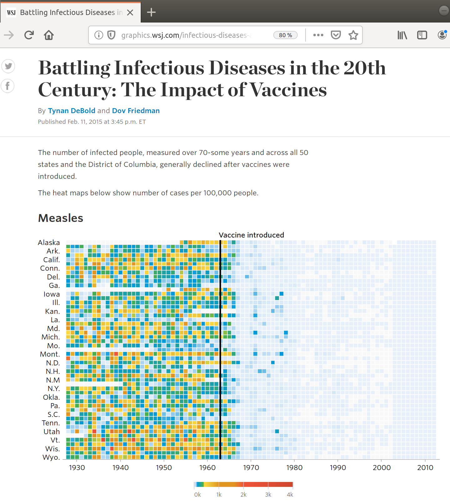
The Wall Street Journal has published in 2015 an set a of data visualization to illustrate the impact of vaccines on the USA population (DeBold & Freedman - 2015). This article presents heat maps across all 50 USA states for various conditions. For most conditions, such as measles, polio, rubella, the effect of the vaccine is very visible.
In this post we are going to replicate the analysis and attempt to generate similar heat maps. There are numerous example already existing (see references) but we complement those by 3D visualizations (3D heat maps and 3D maps).
Preparation
library(knitr)
library(kableExtra) # for table rendering
library(glue)
library(curl)
library(slippymath)
library(purrr)
library(png)
library(dplyr)
library(ggplot2)
library(plotly)
library(ggthemes)
library(data.table)
library(xml2)
library(rvest)
library(maps)

api_key_tycho <- Sys.getenv("API_TYCHO")
set.seed(1234)

# a function to download data from Tycho Website
getTychoCondition <- function(
    condition = "Measles"
    , country_iso = "US"
    , offset = 0
    , limit = 20000
    , api_key_tycho = NULL
){
    url <- glue::glue("https://www.tycho.pitt.edu/api/query?apikey={api_key_tycho}&ConditionName={condition}&CountryISO={country_iso}&limit={limit}&offset={offset}")
    data <- data.table::fread(url)
    return(data)
}
## Loop & Merge
mydata <- lapply(
    (0:21)*20000L
    , getTychoCondition
    , condition = "Measles"
    , country_iso = "US"
    , limit = 20000
    , api_key_tycho = api_key_tycho
    )
measles <- data.table::rbindlist(mydata)
Once loaded the needed libraries, we get the raw data for measles condition using project Tycho’s API.
This API provides data on a weekly basis, we’ll need to aggregate by year and filter out the cumulative information and aggregate the data per year. We obtain the count to fatalities and cases per state over the years as illustrated bellow in a short random extract.
# remove cummulative data
measles <- measles[ PartOfCumulativeCountSeries == 0]
# add year
measles[ , year := lubridate::year(anytime::anydate(PeriodStartDate))]
# agregate per year
measles_ag <- measles %>%
    dplyr::group_by(Admin1Name,year) %>%
    dplyr::summarise_at(c("Fatalities","CountValue"), sum) %>%
    data.table::as.data.table()
# update names for clarity
data.table::setnames(measles_ag, c("state", "year", "fatalities", "cases"))
measles_ag[ , state := as.factor(state) ]

knitr::kable(dplyr::sample_n(measles_ag,7)) %>%
  kable_styling(
    bootstrap_options = c(
      "striped"
      , "hover"
      , "condensed"
      , "responsive"
      )
) %>% scroll_box(width = "100%")| state | year | fatalities | cases |
|---|---|---|---|
| HAWAII | 1975 | 0 | 65 |
| DELAWARE | 1929 | 0 | 907 |
| NEW JERSEY | 1901 | 13 | 20 |
| GEORGIA | 1959 | 0 | 445 |
| WISCONSIN | 1951 | 0 | 32680 |
| NORTH CAROLINA | 1920 | 1 | 736 |
| MINNESOTA | 1944 | 0 | 27073 |
We’ll need mapping between full names of USA States and their code, this
information in available on Tycho api. Once we obtain the data we merge it with
measles data.
url <- glue::glue("https://www.tycho.pitt.edu/api/admin1?apikey={api_key_tycho}&CountryISO=US")
states <- data.table::fread(url)
states[ , state_code := gsub(pattern = "^US-", replacement = "", x = Admin1ISO)]
states[ , ':=' (CountryName = NULL, Admin1ISO = NULL, CountryISO = NULL ) ]

knitr::kable(dplyr::sample_n(states,5)) %>%
  kable_styling(
    bootstrap_options = c(
      "striped"
      , "hover"
      , "condensed"
      , "responsive"
      )
) %>% scroll_box(width = "100%")| Admin1Name | state_code |
|---|---|
| OHIO | OH |
| MASSACHUSETTS | MA |
| MINNESOTA | MN |
| CALIFORNIA | CA |
| IOWA | IA |
measles_ag <- merge(x = measles_ag, y = states, by.x = "state", by.y = "Admin1Name" )As we want to compute the incidence rate, which is defined as the number of cases per person-year of observation, we need to get population data per state and per year. We couldn’t find such a data set (really?) so we decided to scrap it on Wikipedia (which is using FRED as source)
url <- "https://en.wikipedia.org/wiki/List_of_U.S._states_and_territories_by_historical_population#1900%E2%80%932015,_Federal_Reserve_economic_data"

usa_pop <- xml2::read_html(url) %>%
    rvest::html_node(xpath = '//*[@id="mw-content-text"]/div/table[5]') %>%
    rvest::html_table()
names(usa_pop) <- make.names(names(usa_pop))
usa_pop_long <- data.table::as.data.table(melt(usa_pop, id = names(usa_pop)[1]))
setnames(usa_pop_long, c("year","state","population"))
usa_pop_long[ , population := as.numeric(gsub(pattern = ",", replacement = "", x = population))]
usa_pop_long <- merge(x = usa_pop_long, y = states, by.x = "state", by.y = "state_code")
We check the data comparing with available chart on Wikipedia, you can hover on the chart to get state name.
g <- ggplot(usa_pop_long) +
    geom_line(aes(x = year, y = population, col = state)) +
    scale_y_log10() + theme_tufte() +
    theme(legend.position = "none") +
    ggtitle("Evolution of USA population per state")
p <- plotly::ggplotly(g)

p %>% plotly::config(displayModeBar = F)
It looks all good, now we can merge this population data with measles count and we compute incidence ratio (count per year per 100000 people).
measles_ag <- merge(
    x = measles_ag
    , y = usa_pop_long
    , by.x = c("year","state_code")
    , by.y = c("year","state")
    , all.y = TRUE
    )
measles_ag[ , incidence := cases / population * 100000]
measles_ag[ , state_code := as.factor(state_code)]
setnames(measles_ag, old = "Admin1Name", new = "state_name")
We can now reproduce the heat map for the WSJ, they did an amazing work on the color scale, you can found the color reference in the source code but to save time we reused the code of Michael Lee - 2019 (see references at the end of the post). We observe a significant drop of measles incidence following the introduction of the vaccine in 1964.
From wikipedia :
In the United States, reported cases of measles fell from hundreds of thousands to tens of thousands per year following introduction of the vaccine in 1963 (see chart at right). Increasing uptake of the vaccine following outbreaks in 1971 and 1977 brought this down to thousands of cases per year in the 1980s. An outbreak of almost 30,000 cases in 1990 led to a renewed push for vaccination and the addition of a second vaccine to the recommended schedule.
filter_out <- c(
    "AMERICAN SAMOA"
    ,"GUAM"
    , "NORTHERN MARIANA ISLANDS"
    , "PUERTO RICO"
    , "VIRGIN ISLANDS, U.S."
    )


# Save a copy
measles_usa_mainland <- measles_ag[ ! (state_name %in% filter_out )]
save(measles_usa_mainland, file = "./data/measles_usa_mainland.Rda")

dt <- measles_ag[ year > 1929 &
                      ! (state_name %in% filter_out )]

mypal <- c("#e7f0fa", #lighter than light blue
         "#c9e2f6", #light blue
         "#95cbee", #blue
         "#0099dc", #darker blue
         "#4ab04a", #green
         "#ffd73e", #yellow
         "#eec73a", #mustard
         "#e29421", #dark khaki (?)
         "#f05336", #orange red
         "#ce472e") #red

g <- ggplot(
    data = dt
    , aes(x = year, y = state_code, fill = incidence)
    ) +
    geom_tile(colour="white", linejoin = 2,
              width=.9, height=.9) + theme_minimal()  +
    scale_fill_gradientn(
        colours = mypal
        , values=c(0, 0.01, 0.02, 0.03, 0.09, 0.1, .15, .25, .4, .5, 1)
        , limits=c(0, 4000)
        , na.value=rgb(246, 246, 246, max=255)
        , labels=c("0k", "1k", "2k", "3k", "4k")
        , guide = guide_colourbar( barwidth= 0.6 )
        ) +
    scale_y_discrete(limits = rev(levels(droplevels(dt$state_code)))) +
    scale_x_continuous(expand=c(0,0),
                       breaks=seq(1930, 2010, by=10)) +
    geom_segment(x=1963, xend=1963, y=0, yend=56.5, size=.7) +
    ggtitle("Evolution of Measles incidence in USA (case/100000)") +
    theme(
        axis.title.y=element_blank()
        , axis.text.y = element_text(size = 6)
        , axis.text.x = element_text(angle = 90)
        , panel.grid = element_blank()
        , axis.ticks.y=element_blank()
        )
p <- plotly::ggplotly(g)

p %>% plotly::config(displayModeBar = F)
Alternative view : maps
The heat map plot above is interesting as it gives a global overview over time for all the states but it’s quite difficult to get a spatial view on the topic. Thus we propose to use small multiple plot based on a map of USA states over time and incidence per state using the same color code. We can clearly see the trend toward lower incidence as well as the outbreaks from 1971 (Montana, Texas, Kentucky) and 1977 (Montana, Iowa). Seems also that Florida was less exposed over the years.
# load United States state map data
usa_states <- map_data("state")
usa_states$region <- toupper(usa_states$region)


merged_states <- merge(
    x = usa_states
    , y = dt[ year %in% c(1950:1985) & !(state %in% c("HAWAII", "ALASKA"))]
    , by.x = "region"
    , by.y = "state_name"
    , all.x = TRUE
    , all.y = TRUE
    )

p <- ggplot()
p <- p + geom_polygon(
    data = merged_states
    , aes(x = long, y = lat, group = group, fill = incidence)
    , color="white"
    , size = 0.2
    ) +
    theme_tufte() + coord_map() + facet_wrap(facets = . ~ year) +
    scale_fill_gradientn(
        colours = mypal
        , values=c(0, 0.01, 0.02, 0.03, 0.09, 0.1, .15, .25, .4, .5, 1)
        , limits=c(0, 4000)
        , na.value=rgb(246, 246, 246, max=255)
        #, labels=c("0k", "1k", "2k", "3k")
        , guide = guide_colourbar(
            ticks=T
            , nbin=50
            #, barheight=.5
            , label=T
            , barwidth= 0.5
            )
        ) +
    ggtitle("Evolution of Measles incidence in USA (case/100000)") +
    theme(
        axis.title = element_blank()
        , axis.text = element_blank()
        , axis.ticks = element_blank()
        )
p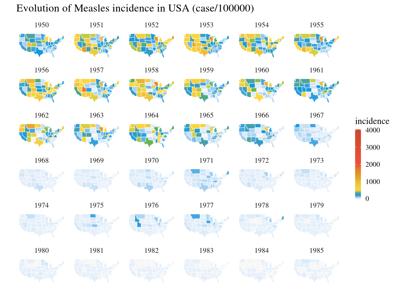
References
Code information
This post was regenerated on 2019-12-12 with the following set-up.
sessionInfo()## R version 3.6.1 (2017-01-27)
## Platform: x86_64-pc-linux-gnu (64-bit)
## Running under: Ubuntu 16.04.6 LTS
##
## Matrix products: default
## BLAS: /home/travis/R-bin/lib/R/lib/libRblas.so
## LAPACK: /home/travis/R-bin/lib/R/lib/libRlapack.so
##
## locale:
## [1] LC_CTYPE=en_US.UTF-8 LC_NUMERIC=C
## [3] LC_TIME=en_US.UTF-8 LC_COLLATE=en_US.UTF-8
## [5] LC_MONETARY=en_US.UTF-8 LC_MESSAGES=en_US.UTF-8
## [7] LC_PAPER=en_US.UTF-8 LC_NAME=C
## [9] LC_ADDRESS=C LC_TELEPHONE=C
## [11] LC_MEASUREMENT=en_US.UTF-8 LC_IDENTIFICATION=C
##
## attached base packages:
## [1] stats graphics grDevices utils datasets methods base
##
## other attached packages:
## [1] maps_3.3.0 rvest_0.3.5 xml2_1.2.2 data.table_1.12.8
## [5] ggthemes_4.2.0 plotly_4.9.1 ggplot2_3.2.1 dplyr_0.8.3
## [9] png_0.1-7 purrr_0.3.3 slippymath_0.3.1 curl_4.3
## [13] glue_1.3.1 kableExtra_1.1.0 knitr_1.26
##
## loaded via a namespace (and not attached):
## [1] Rcpp_1.0.3 lubridate_1.7.4 tidyr_1.0.0 assertthat_0.2.1
## [5] zeallot_0.1.0 digest_0.6.23 mime_0.7 R6_2.4.1
## [9] plyr_1.8.5 backports_1.1.5 evaluate_0.14 httr_1.4.1
## [13] highr_0.8 blogdown_0.17.1 pillar_1.4.2 rlang_0.4.2
## [17] lazyeval_0.2.2 rstudioapi_0.10 rmarkdown_1.18 labeling_0.3
## [21] webshot_0.5.2 readr_1.3.1 stringr_1.4.0 selectr_0.4-2
## [25] htmlwidgets_1.5.1 munsell_0.5.0 shiny_1.4.0 anytime_0.3.6
## [29] compiler_3.6.1 httpuv_1.5.2 xfun_0.11 pkgconfig_2.0.3
## [33] htmltools_0.4.0 tidyselect_0.2.5 tibble_2.1.3 bookdown_0.16
## [37] viridisLite_0.3.0 crayon_1.3.4 withr_2.1.2 later_1.0.0
## [41] grid_3.6.1 xtable_1.8-4 jsonlite_1.6 gtable_0.3.0
## [45] lifecycle_0.1.0 magrittr_1.5 scales_1.1.0 stringi_1.4.3
## [49] mapproj_1.2.6 farver_2.0.1 reshape2_1.4.3 promises_1.1.0
## [53] vctrs_0.2.0 tools_3.6.1 Cairo_1.5-10 hms_0.5.2
## [57] crosstalk_1.0.0 fastmap_1.0.1 yaml_2.2.0 colorspace_1.4-1