Geography

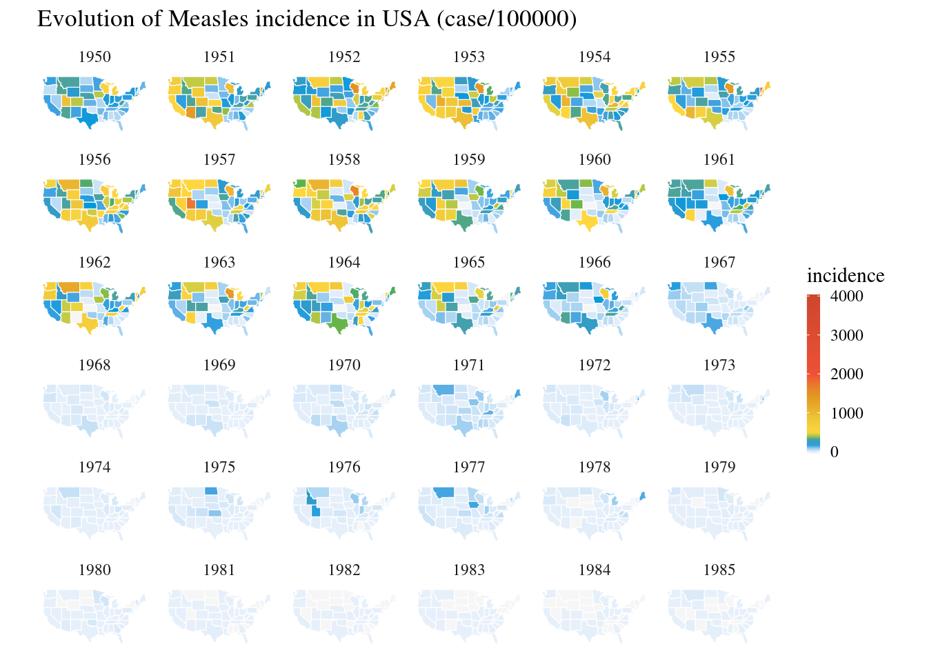
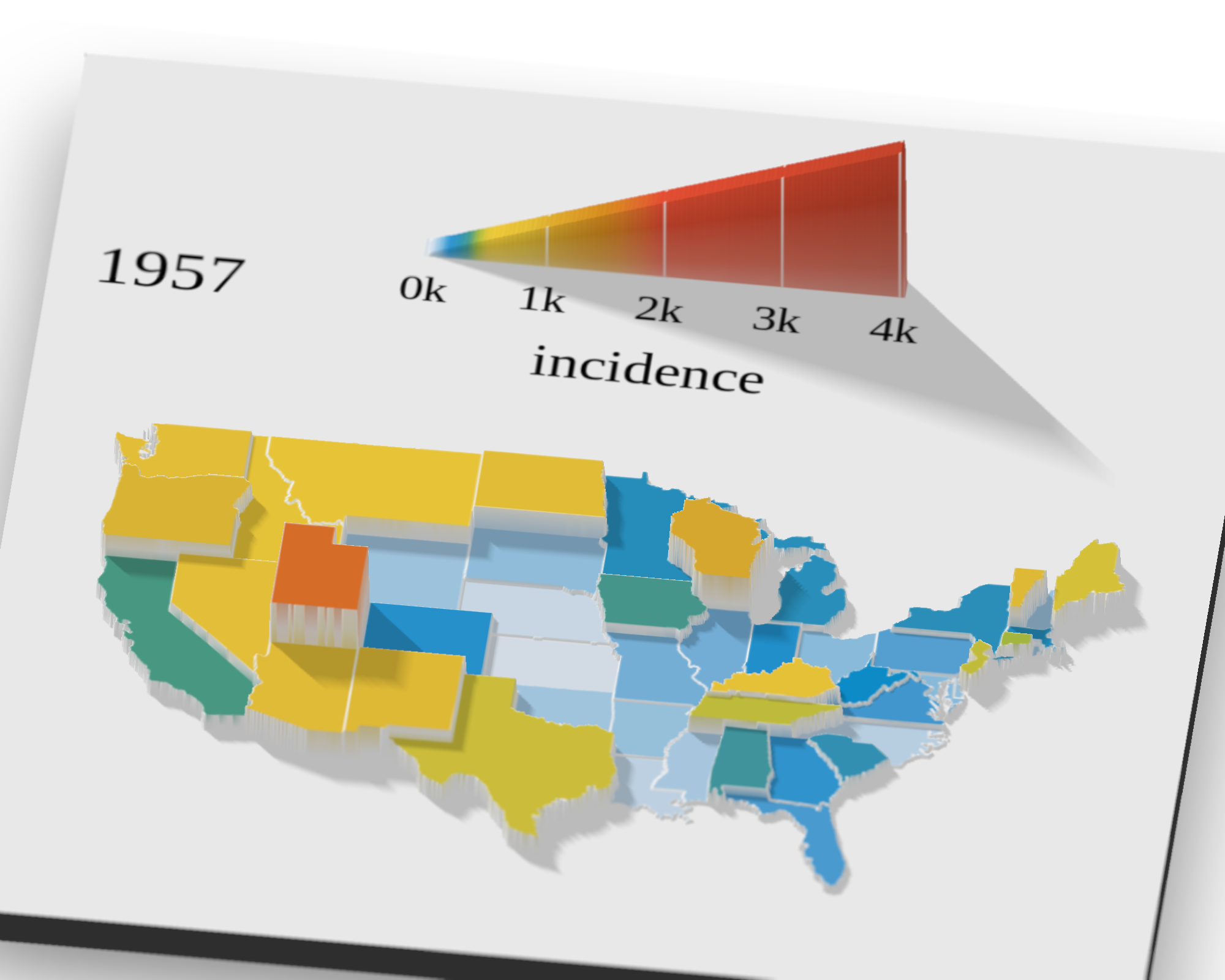
3D annimation about Measles in USA

In a previous post, we published some data vizualisations (heat map and maps) inspired by an article of The Wall Street Journal about the impact of measles vaccine in the USA. We are now going to present an alternative visualization based on 3D plots. Such plots are not always the best for data vizualisation but they are still interesting, especially when they are annimated.

Continue reading

The impact of vaccines, case of Measles in USA

The Wall Street Journal has published in 2015 an set a of data visualization to illustrate the impact of vaccines on the USA population (DeBold & Freedman - 2015). This article presents heat maps across all 50 USA states for various conditions. For most conditions, such as measles, polio, rubella, the effect of the vaccine is very visible. In this post we are going to replicate the analysis and attempt to generate similar heat maps.

Continue reading

The new french election geography

The last European elections were on June 26th, 2019. One of the major observation was the increase of extreme right votes, and more particularily the shift toward extreme right of areas which used to be left voters. In this post we are going to visualize the results of this election designing a new shape for France. The objective is to create a choropleth map of the six main lists of candidates showing the percentage of votes per list for each french communes.

Continue reading

Visualize Satellite images with Mapbox API

Accessing to satellite images based on geolocalization has many applications in data visualization and data sciences. There are several alternative of services which provide API interfaces which can be integrated in notebooks or articles, for instance : Google Maps, Bings Maps, OpenStreetMap, … You can find free, freemium or premium services. In this post we are going to illustrate a short demo of mapbox satellite API. Mapbox present itself as the “location data platform for mobile and web applications”.

Continue reading

China mainland population density

In an earlier post we mapped the urbanization rate of China at province level. In this post we will go futher by visualizing where Chinese people are living using a gridded population map. We will use the NASA dataset (Population Density Grid, v3 (1990, 1995, 2000)) which consists of estimates of human population by 2.5 arc-minute grid cells. A proportional allocation gridding algorithm, utilizing more than 300,000 national and sub-national administrative units, is used to assign population values to grid cells.

Continue reading

Getting and cleaning data, example of Chinese airports - Part 4/5

One of the big problem for anybody interested in China and data science is the availability of data sets. There are limited free resources available and they are often incomplete or inaccurate. Getting data and especially cleaning data becomes one of the biggest pain of data science applied to China. The objective of this series of post is to illustrate the problem and associated process on a specific example: plot a map of the airports of mainland China.

Continue reading

Getting and cleaning data, example of Chinese airports - Part 3/5

One of the big problem for anybody interested in China and data science is the availability of data sets. There are limited free resources available and they are often incomplete or inaccurate. Getting data and especially cleaning data becomes one of the biggest pain of data science applied to China. The objective of this group of post is to illustrate the problem and associated process on a specific example: plot a map of the airports of mainland China.

Continue reading