By Datapleth.io | August 17, 2019
It’s summer 2019, the so called “yield curve” inversion is on the news, a great (as usual) nytimes inforgraphics is explaining what is at stake, to make it short, it’s about prediction of economic future. The objective of these posts is to propose alternatives to these visuals and to extend to other countries such as France.
As per NY Times, in A 3-D View of a Chart That Predicts The Economic Future: The Yield Curve :
The yield curve shows how much it costs the federal government to borrow money for a given amount of time, revealing the relationship between long- and short-term interest rates. It is, inherently, a forecast for what the economy holds in the future — how much inflation there will be, for example, and how healthy growth will be over the years ahead — all embodied in the price of money today, tomorrow and many years from now.
We display a screenshot of the 3d curve bellow.
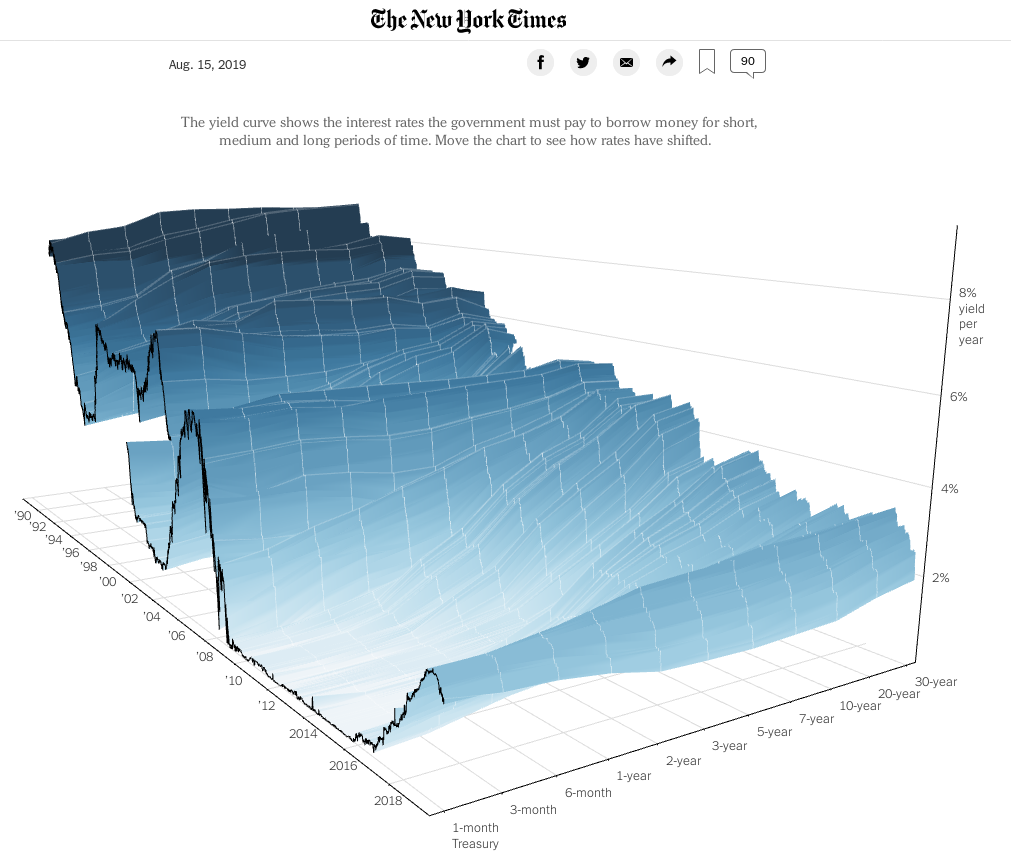
The work done by the nytimes team is amazing, it’s difficult to make 3d plots so easy to understand. However we see two main problems with this curve :
- The y axis (yield rate horizon), is distorted, 10 years interval between 20 and 30 years is seen as equivalent to the interval between 1 and 3 months.
- It’s not very easy to see the inversion zones.
We’ll try to make an alternative version of the plot with different y axis and color scheme for the surface.
Preparation
Let’s as usual load the libraries we need.
library(xml2)
library(dplyr)
library(data.table)
library(plotly)
Getting and cleaning the data for USA
Data source for USA data is the U.S Department of the treasury (see here). They provide the data as XML with one URL per year.
We build first a vector containing all the URL of XML data files.
url_pattern_usa <- "https://data.treasury.gov/feed.svc/DailyTreasuryYieldCurveRateData?$filter=year(NEW_DATE)%20eq%20"
uri_usa <- paste0(url_pattern_usa, 1990:2019)
We create a function to read the remote XML, parse it and convert it as a data.table.
getXmlDataUsa <- function(url){
    message(url)
    data <- read_xml(url)
    properties <- xml_find_all(x = data, xpath = "//m:properties") %>%
        as_list()
    daily <- rbindlist(properties)

    fixMe <- function(x){}
    ## use as.character to get the NULL values converted to NA
    ## when converted to numeric
    daily[ , ':=' (
        Id = as.numeric(Id),
        NEW_DATE = as.Date(unlist(NEW_DATE)),
        BC_1MONTH = as.numeric(as.character(BC_1MONTH)),
        BC_2MONTH = as.numeric(as.character(BC_2MONTH)),
        BC_3MONTH = as.numeric(as.character(BC_3MONTH)),
        BC_6MONTH = as.numeric(as.character(BC_6MONTH)),
        BC_1YEAR = as.numeric(as.character(BC_1YEAR)),
        BC_2YEAR = as.numeric(as.character(BC_2YEAR)),
        BC_3YEAR = as.numeric(as.character(BC_3YEAR)),
        BC_5YEAR = as.numeric(as.character(BC_5YEAR)),
        BC_7YEAR = as.numeric(as.character(BC_7YEAR)),
        BC_10YEAR = as.numeric(as.character(BC_10YEAR)),
        BC_20YEAR = as.numeric(as.character(BC_20YEAR)),
        BC_30YEAR = as.numeric(as.character(BC_30YEAR)),
        BC_30YEARDISPLAY = NULL
    )
    ]
    return(daily)
}
Now we are going to parse each of these files and bind them in one data.table. This can take a bit of time depending on your connection and the remote site.
all_usa_data <- lapply(uri_usa, getXmlDataUsa)
all_usa_data <- rbindlist(all_usa_data)
Finally we create a data set in long format.
all_usa_data_long <- data.table::melt(
    all_usa_data,
    measure.vars = c(
        "BC_1MONTH", "BC_2MONTH", "BC_3MONTH", "BC_6MONTH",
        "BC_1YEAR", "BC_2YEAR", "BC_3YEAR", "BC_5YEAR", "BC_7YEAR",
        "BC_10YEAR", "BC_20YEAR", "BC_30YEAR"),
    variable.name = "horizon",
    value.name = "rate")
And we convert horizon to numerical values in months, add a data column as numeric.
all_usa_data_long[ horizon == "BC_1MONTH", horizon := "1"]
all_usa_data_long[ horizon == "BC_2MONTH", horizon := "2"]
all_usa_data_long[ horizon == "BC_3MONTH", horizon := "3"]
all_usa_data_long[ horizon == "BC_6MONTH", horizon := "6"]
all_usa_data_long[ horizon == "BC_1YEAR", horizon := "12"]
all_usa_data_long[ horizon == "BC_2YEAR", horizon := "24"]
all_usa_data_long[ horizon == "BC_3YEAR", horizon := "36"]
all_usa_data_long[ horizon == "BC_5YEAR", horizon := "60"]
all_usa_data_long[ horizon == "BC_7YEAR", horizon := "84"]
all_usa_data_long[ horizon == "BC_10YEAR", horizon := "120"]
all_usa_data_long[ horizon == "BC_20YEAR", horizon := "240"]
all_usa_data_long[ horizon == "BC_30YEAR", horizon := "360"]
all_usa_data_long[, horizon := as.numeric(as.character(horizon))]
save(all_usa_data_long, file = "./data/all_usa_rate.Rda")
We make a quick plot, it’s always usefull to explore the data.
g <- ggplot(all_usa_data_long)
g <- g + geom_point(aes(x = NEW_DATE,
                        y = rate,
                        col = horizon),
                    alpha = 0.5, size = 0.5)
g <- g + facet_grid(facets =  horizon ~ . )
g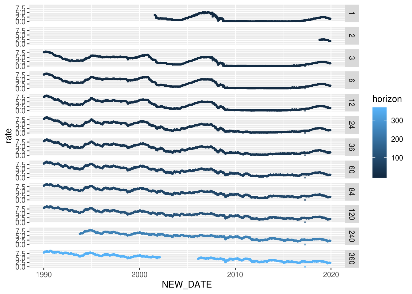
Here we discover that there is a strange point on 2017-04-14 for which all rates for all horizons are equal to zero, we decide to remove these. Rates on 2 month are only avaible recently we decide to remove these as well.
all_usa_data_long <- all_usa_data_long[ NEW_DATE != "2017-04-14"]
all_usa_data_long <- all_usa_data_long[ ! ( horizon %in% c(2) ) ]
Plotting the 3d yield curve
There are several alternatives to plot 3d surfaces in R but to make it
interactive, we choose the plotly package. We have to move back the data in
a long format.
For the surface color, we will plot it as the ration to rate with 3month horizon as reference. Thus we create a new matrix with the calculation and deal with special values when 3 months rate is 0.
## reshape de data to get a matrix (for plotly)
d <- copy(all_usa_data_long)
d <- data.table::dcast(d, NEW_DATE ~ horizon, value.var = "rate")
d[ , NEW_DATE := NULL]

## compute ratio to 3 month rate
c <- copy(d)
setnames(c, make.names(names(c)))
c[ , ':=' (
    X1 = (X1 - X3) / abs(X3),
    X6 = (X6 - X3) / abs(X3),
    X12 = (X12 - X3) / abs(X3),
    X24 = (X24 - X3) / abs(X3),
    X36 = (X36 - X3) / abs(X3),
    X60 = (X60 - X3) / abs(X3),
    X84 = (X84 - X3) / abs(X3),
    X120 = (X120 - X3) / abs(X3),
    X240 = (X240 - X3) / abs(X3),
    X360 = (X360 - X3) / abs(X3)
)]
## deal with zero values
c[ X3 == 0 , ':=' (
    X1 = NA,
    X6 = NA,
    X12 = NA,
    X24 = NA,
    X36 = NA,
    X60 = NA,
    X84 = NA,
    X120 = NA,
    X240 = NA,
    X360 = NA
)]
c[ , X3 := 1 ]
We are now ready to plot. We choose the color theme of Dark2 palette (green & orange).
p <- plot_ly(
    x = sort(unique(all_usa_data_long$NEW_DATE)),
    y = sort(unique(all_usa_data_long$horizon)),
    z = t(as.matrix(d)),
    type = "surface",
    surfacecolor = t(as.matrix(c)),
    cmin = -0.35,
    cmax = +0.35,
    colorscale = list(
        list(
            0,
            "rgb(215, 95, 2)"
        ),
        list(
            0.5,
            "rgb(231, 245, 255)"
        ),
        list (
            1,
            "rgb(25, 155, 115)"
        )
    ),
    colorbar = list(
        title='ratio to<br>3 month<br>yield',
        side = 'bottom',
        thickness='10',
        xpad = 5,
        y = 0.8
    ),
    lighting = list(
        ambient = 0.8,
        diffuse = 0.8,
        specular = 0.2,
        roughness = 0.8,
        fresnel = 0.2
    ),
    opacity = 0.9,
    hoverlabel = list(
        bgcolor = "rgb(255, 255, 255)"
    )
) %>%
    plotly::layout(
        #title = "3D yield curve",
        width = 800,
        height = 500,
        scene=list(
            xaxis=list(title="date"),
            yaxis=list(title="horizon"),
            zaxis=list(title="rate"),
            aspectmode = "manual",
            aspectratio = list(x=4,y=2,z=1.3),
            camera = list(
                eye = list(x = 3, y = -3, z = 0.3 ),
                center = list( x = 0.8, y = 0, z = 0)
            )
        )
    ) %>%
    config(displayModeBar = F)
p
References
From The New York Times :
- https://www.nytimes.com/2019/08/15/upshot/inverted-yield-curve-bonds-football-analogy.html
- https://www.nytimes.com/interactive/2015/03/19/upshot/3d-yield-curve-economic-growth.html?module=inline
Other R works :