Blogs

The unicorn bubble - Donuts or Waffles ?

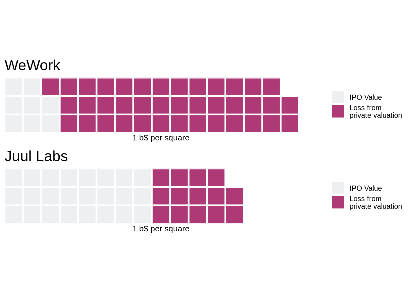
How Silicon Valley feels right now ? Few days ago the Wall Street Journal (@WSGGraphics) published a tweet about Unicorns loosing value between their last private-market valuation and their IPO price. In this post, we will replicate their visuals and we will demonstrate the problem of using donuts like charts. We will propose an alternative using waffle charts. They illustrated the analysis with some circular charts. The problem with such visuals is that human eye is very bad ad comparing surfaces when they are represented by disks.

Continue reading

3D annimation about Measles in USA

In a previous post, we published some data vizualisations (heat map and maps) inspired by an article of The Wall Street Journal about the impact of measles vaccine in the USA. We are now going to present an alternative visualization based on 3D plots. Such plots are not always the best for data vizualisation but they are still interesting, especially when they are annimated.

Continue reading

The impact of vaccines, case of Measles in USA

The Wall Street Journal has published in 2015 an set a of data visualization to illustrate the impact of vaccines on the USA population (DeBold & Freedman - 2015). This article presents heat maps across all 50 USA states for various conditions. For most conditions, such as measles, polio, rubella, the effect of the vaccine is very visible. In this post we are going to replicate the analysis and attempt to generate similar heat maps.

Continue reading

The new french election geography

The last European elections were on June 26th, 2019. One of the major observation was the increase of extreme right votes, and more particularily the shift toward extreme right of areas which used to be left voters. In this post we are going to visualize the results of this election designing a new shape for France. The objective is to create a choropleth map of the six main lists of candidates showing the percentage of votes per list for each french communes.

Continue reading

The french yield curve problem

Following our previous post on the USA yield curve inversion, we are going to evaluate the situation in other countries, starting with France. We can observe similar pattern on the recent interest rates for which there is an inversion, the long term rates are lower than the short term rates. However, we were not (yet) able to get historical data for all horizon. “Banque de France” is not releasing such information as of today.

Continue reading

Do we have a yield curve problem? (made in USA)

It’s summer 2019, the so called “yield curve” inversion is on the news, a great (as usual) nytimes inforgraphics is explaining what is at stake, to make it short, it’s about prediction of economic future. The objective of these posts is to propose alternatives to these visuals and to extend to other countries such as France. As per NY Times, in A 3-D View of a Chart That Predicts The Economic Future: The Yield Curve :

Continue reading

Visualize Satellite images with Mapbox API

Accessing to satellite images based on geolocalization has many applications in data visualization and data sciences. There are several alternative of services which provide API interfaces which can be integrated in notebooks or articles, for instance : Google Maps, Bings Maps, OpenStreetMap, … You can find free, freemium or premium services. In this post we are going to illustrate a short demo of mapbox satellite API. Mapbox present itself as the “location data platform for mobile and web applications”.

Continue reading