By Datapleth.io | June 24, 2016
In this second part we are going to compare pollutions levels (pm2.5) between the cities of Beijing, Shanghai and Paris. We reused the data extracted in the previous post and we build simple visualisation to compare for each day, which city is the worse. Surprisingly (for french), Paris is not always the bet to live and there are some days, pollution is worse there than Shanghai or Beijing.
Overall Process :
- Get data : from US embassy PM2.5 hourly readings for China and Airparif for France
- Check and clean data
- Exploratory analysis
- Comparison of 2015 vs. 2014 and 2013
- Conclusions
In this second part we will cover steps 3, exploration of the PM2.5 data and we will focus only on the cities of Beijing, Shanghai and Paris.
Required libraries
We need several R packages for this study.
library(lubridate)
library(dplyr)
library(ggplot2)
library(ggthemes)
Load part 1 results
Firsly we load previous post data and subset data for the 3 cities we focus on, only from 2012 to 2015 to get full year data.
load(file = "./data/aqi-1.Rda")
aqi <- aqi[
        (aqi$city %in% c("Beijing", "Shanghai", "Paris") )&
                aqi$year > 2011 &
                aqi$year < 2016,]
Comparison between cities
h <- ggplot(data = aqi, group = year) +
  theme_tufte() + #theme(legend.position = "none") +
  geom_hline(yintercept = 0, color = "grey") +
  facet_grid(facets = . ~ city) +
  #geom_boxplot(aes(x = year, y = pm2.5, col = city, group = year, fill = NULL), outlier.shape = NA, na.rm = TRUE) +
  geom_point(aes(x = jitter(year), y = pm2.5, col = city), alpha = 0.2) +
  ggtitle("Comparison of 3 cities pm2.5 levels") +
  xlab("Year") +
  scale_x_continuous(breaks=2012:2015) +
  theme(axis.text.x = element_text(angle = 90)) +
  theme(axis.title.x = element_text(margin = margin(t = 20, r = 0, b = 0, l = 0))) +
  ylab("pm2.5 readings in mg / m3") +
  scale_color_brewer(palette="Dark2") #Dark2 as alternative
h
## Warning: Removed 3308 rows containing missing values (geom_point).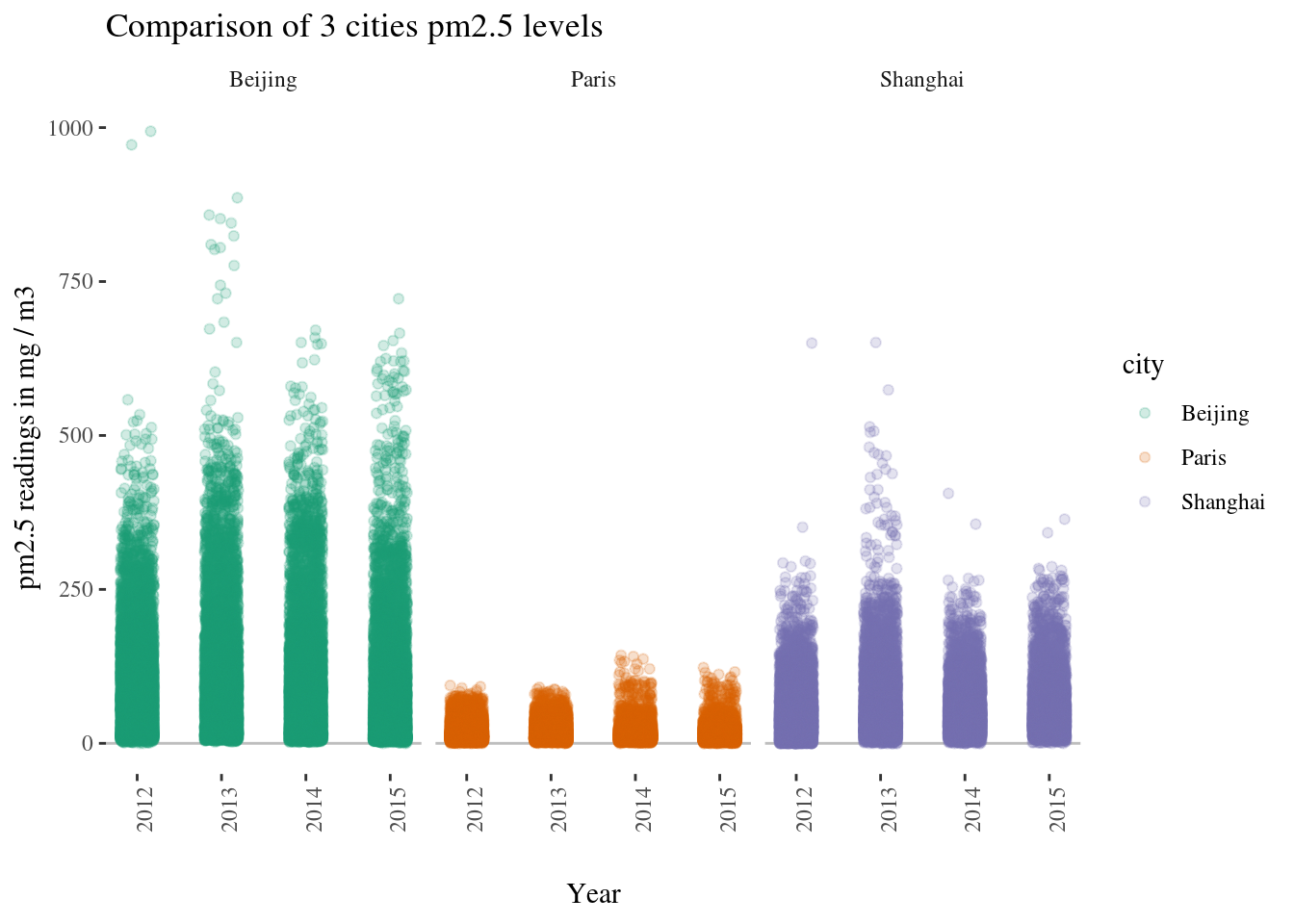
Shanghai vs. Beijing
Let’s compare now the situation between Shanghai and Beijing. We take each day we have measurements for the both cities and we compare the situation. No surprise, Beijing looks worse but not always.
shanghai <- aqi[aqi$city == "Shanghai",]
beijing <- aqi[aqi$city == "Beijing",]
bs <- merge(x = shanghai, by.x = "date.time", y = beijing, by.y = "date.time")
bs <- bs[ !is.na(bs$pm2.5.x) & !is.na(bs$pm2.5.y), ]
bs$most_polluted <- "Beijing"
bs[bs$pm2.5.y <= bs$pm2.5.x,]$most_polluted <- "Shanghai"

h <- ggplot(data = bs, group = year) +
  theme_tufte() + #theme(legend.position = "none") +
  geom_hline(yintercept = 0, color = "grey") +
  geom_point(aes(x = pm2.5.x, y = pm2.5.y, col = most_polluted), alpha = 0.2) +
  ggtitle("Comparison of pm2.5 readings in Beijing vs. Shanghai") +
  xlab("pm2.5 readings in shanghai") +
  theme(axis.text.x = element_text(angle = 90)) +
  theme(axis.title.x = element_text(margin = margin(t = 20, r = 0, b = 0, l = 0))) +
  ylab("pm2.5 readings in Beijing (same day)") +
  coord_fixed() + xlim(c(0,1000)) + ylim(c(0,1000)) +
  scale_color_brewer(palette="Dark2") #Dark2 as alternative
h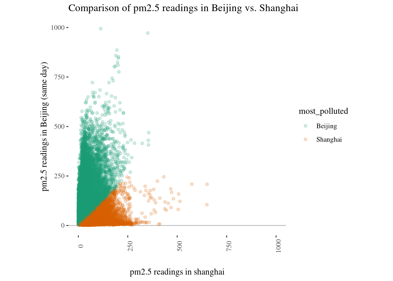
We can now have a look to the distribution of pm2.5 readings with an histogram.
h <- ggplot(data = aqi[aqi$city %in% c("Shanghai","Beijing", ""),]) +
  theme_tufte() + #theme(legend.position = "none") +
  geom_vline(xintercept = 0, color = "grey") +
  geom_histogram(aes(x = pm2.5, fill = city), alpha = 0.8, bins = 50) +
  facet_grid(facets = city ~ . ) +
  ggtitle("Comparison of pm2.5 readings in Beijing vs. Shanghai") +
  xlab("pm2.5 readings") +
  theme(axis.text.x = element_text(angle = 90)) +
  theme(axis.title.x = element_text(margin = margin(t = 20, r = 0, b = 0, l = 0))) +
  ylab("Number of days (2012 to 2016") + xlim(c(0,500)) +
  scale_fill_brewer(palette="Dark2") #Dark2 as alternative
h
## Warning: Removed 1880 rows containing non-finite values (stat_bin).## Warning: Removed 4 rows containing missing values (geom_bar).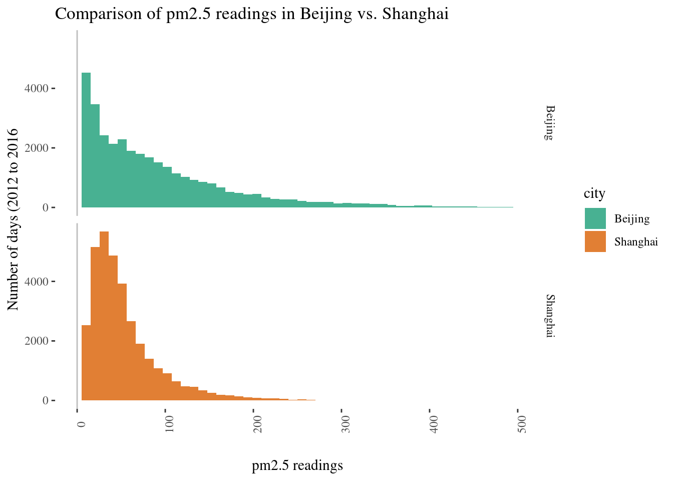
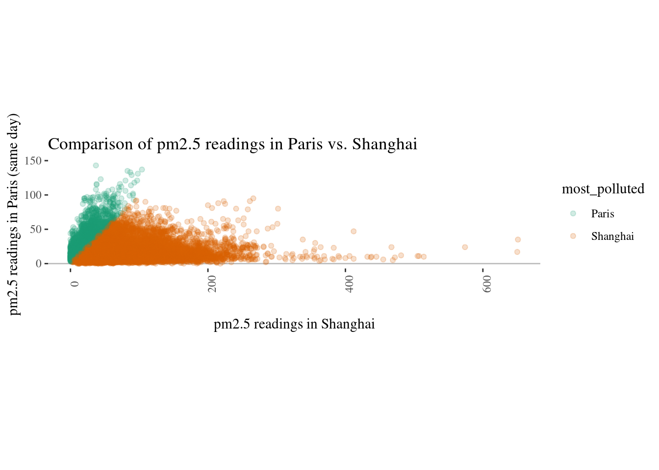
Shanghai vs. Paris
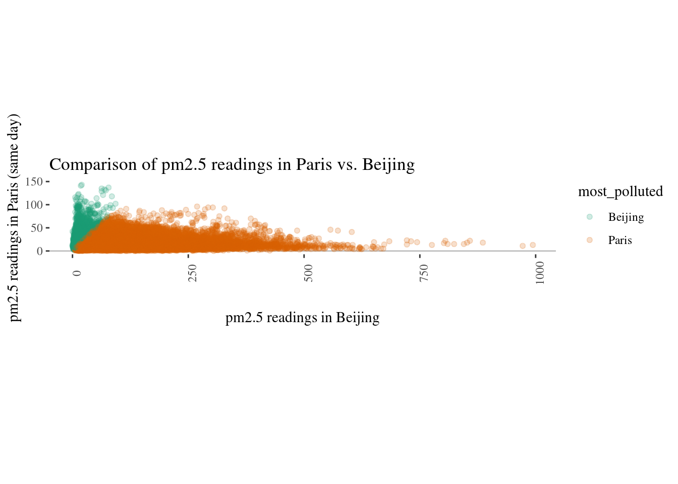
Paris vs. Beijing
Next ?
Let’s save the data frame for next part
save( list = c("aqi"
               ),
      file = "./data/aqi-2.Rda")